"Feel understood. Feel lighter. Feel calm — your way."
01. Summary
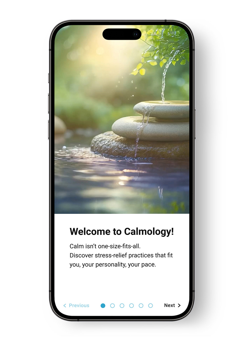
People often feel overwhelmed by stress but don’t know where to start. Most apps offer generic activities that don’t fit different emotional needs. Calmology introduces a simple personality assessment that unlocks a personalized calm plan, making stress relief feel approachable, relevant, and supportive.
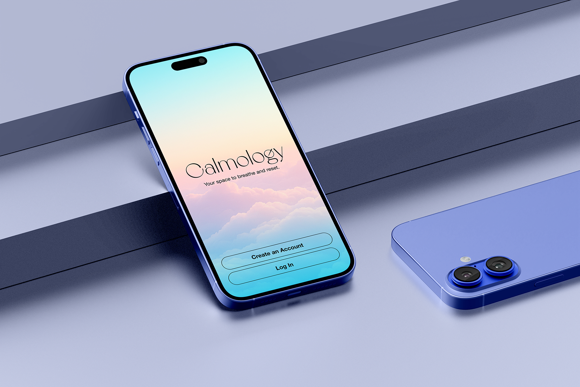
A Personality-Based
Stress Relief App
Helping overwhelmed people find stress relief that actually fits how they think, feel, and recharge.
Stress Relief App
Helping overwhelmed people find stress relief that actually fits how they think, feel, and recharge.
Role: UX Research • Product Strategy
UI Design • Branding
Timeline: 4 weeks
Tools: Figma • ChatGPT (ideation)
Project Type: Mobile App, End-to-End UX Flow
UI Design • Branding
Timeline: 4 weeks
Tools: Figma • ChatGPT (ideation)
Project Type: Mobile App, End-to-End UX Flow
02. Problem
Users struggle to stay consistent with stress-relief apps because the experience feels general and demanding. They need something that understands their energy level, emotional state, and personal tendencies, and guides them with warmth instead of pressure.
03. The Solution
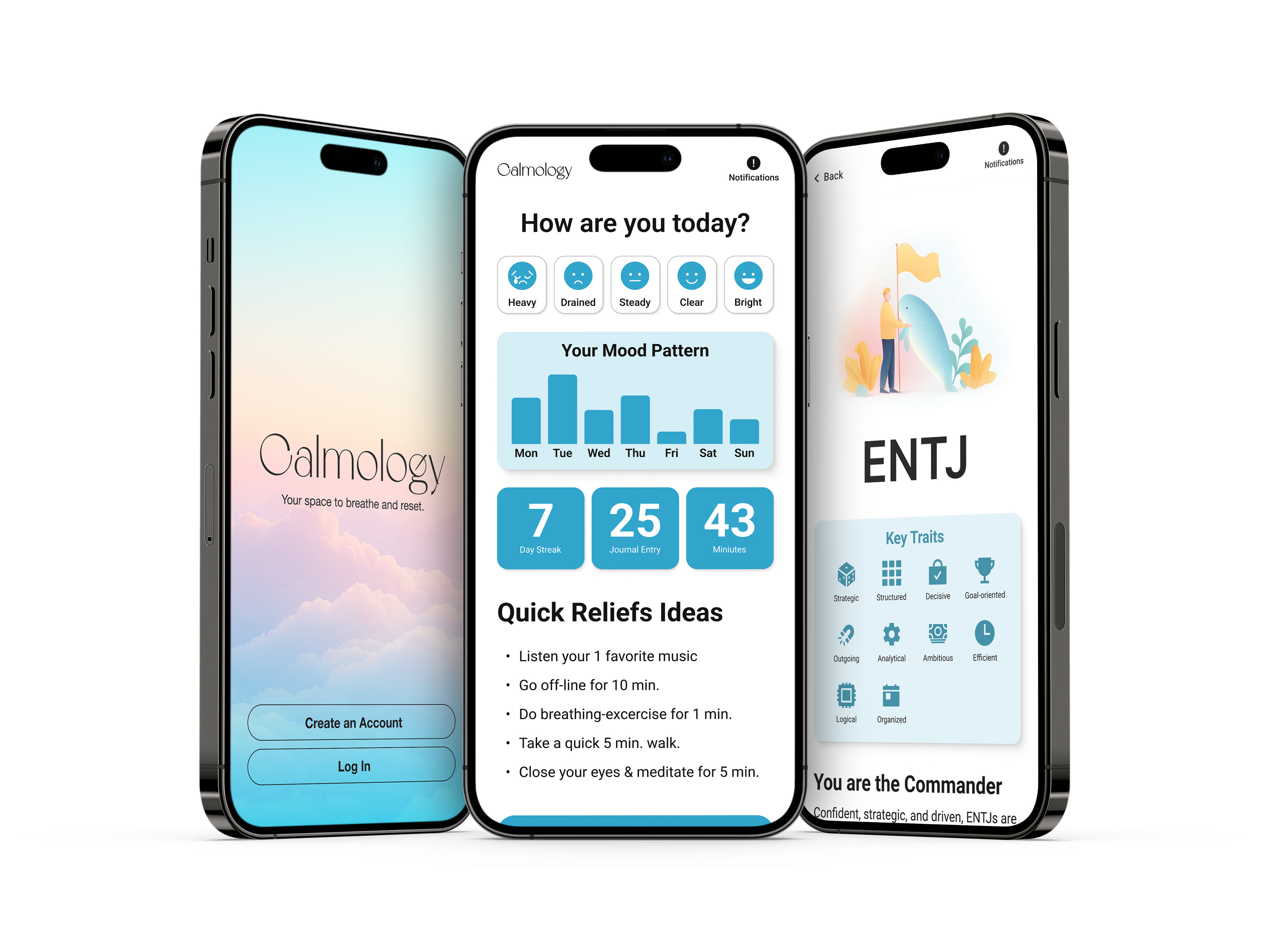
Calmology creates a personalized calm journey based on a short Myers–Briggs–inspired test. The app offers small activities matched to time, mood, and environment, presented through a visually calm interface that feels soft and human.
04. Research Insights
User Interviews
Interviews revealed that stress often comes from overthinking rather than lack of resources. Users preferred small, manageable actions and a tone that felt gentle rather than clinical. Visual calm played
a key role in helping users feel emotionally safe.
Interviews revealed that stress often comes from overthinking rather than lack of resources. Users preferred small, manageable actions and a tone that felt gentle rather than clinical. Visual calm played
a key role in helping users feel emotionally safe.
Competitive Analysis
Headspace, Calm, Finch, and Stoic provided inspiration but lacked personalization by personality.
Many felt like task managers rather than support systems. Users disengaged when the experience
didn’t feel personal.
Headspace, Calm, Finch, and Stoic provided inspiration but lacked personalization by personality.
Many felt like task managers rather than support systems. Users disengaged when the experience
didn’t feel personal.
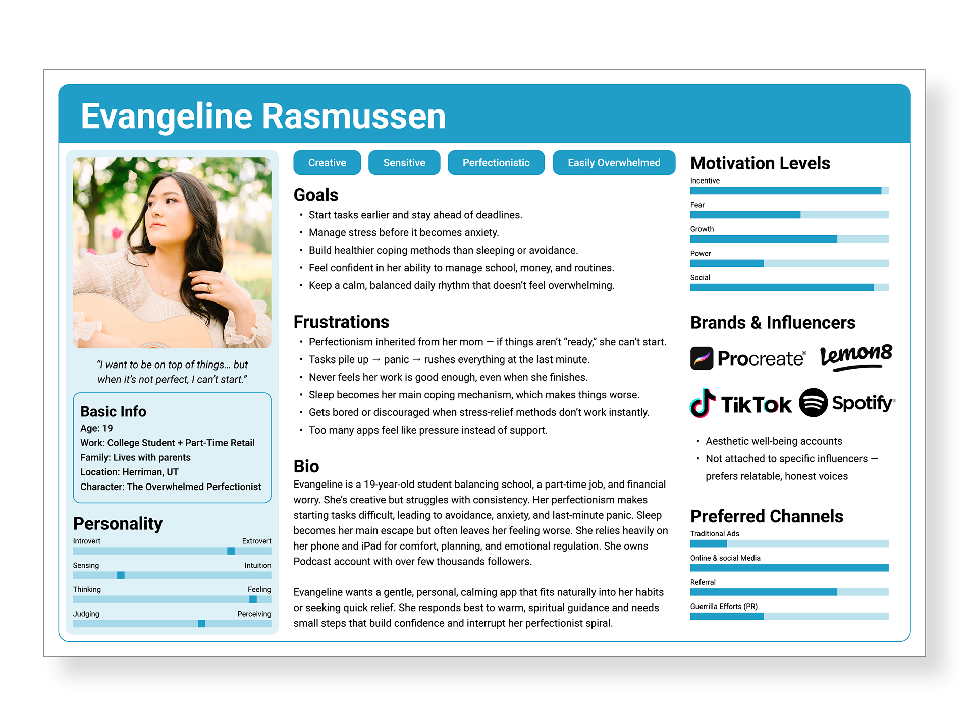
05. Persona
Meet Evangeline (19)
Evangeline is a creative, sensitive student who feels things deeply and often gets caught in perfectionism. She turns to her phone for relief or distraction but struggles to stay consistent when tools feel demanding or impersonal. What she needs most is gentle guidance, emotional clarity, and quick moments of relief that don’t overwhelm her.
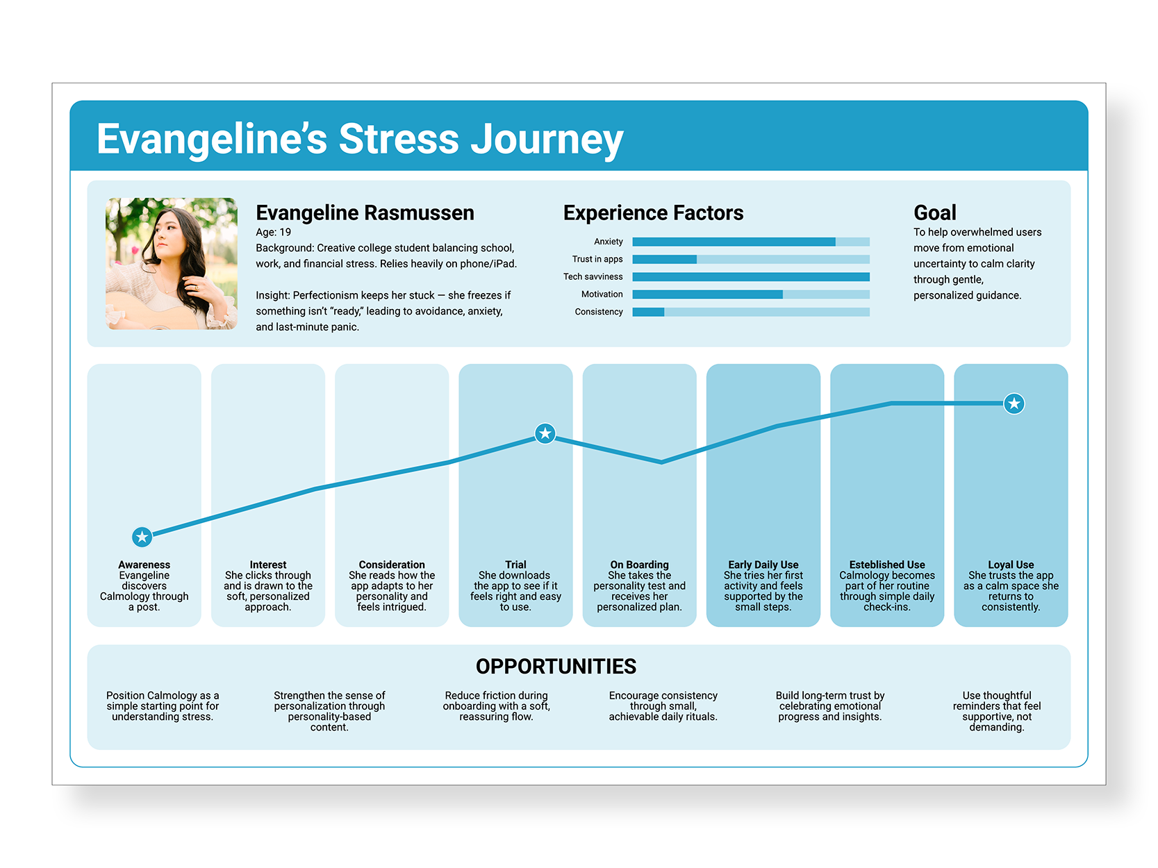
06. User Journey Map
Evangeline begins overwhelmed and unsure where to start. During onboarding, her personality results help her feel seen, and her personalized calm plan gives her a simple starting point. In daily use, the soft visuals and warm tone create a sense of safety. Over time, the app becomes a place she returns to for clarity and routine. Her experience moves from “I don’t know where to start” to “This feels like it understands me.”
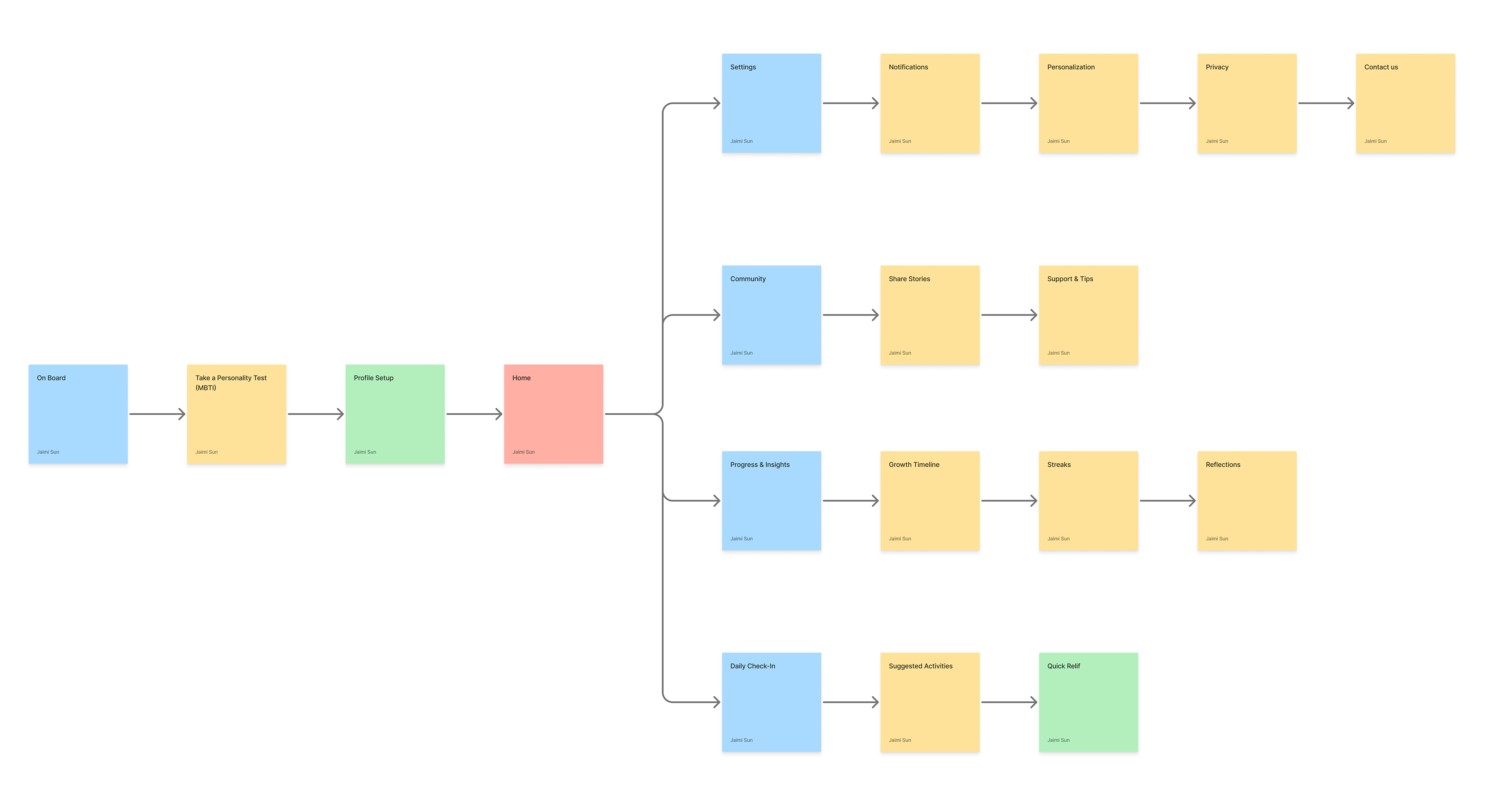
07. Design & Structure
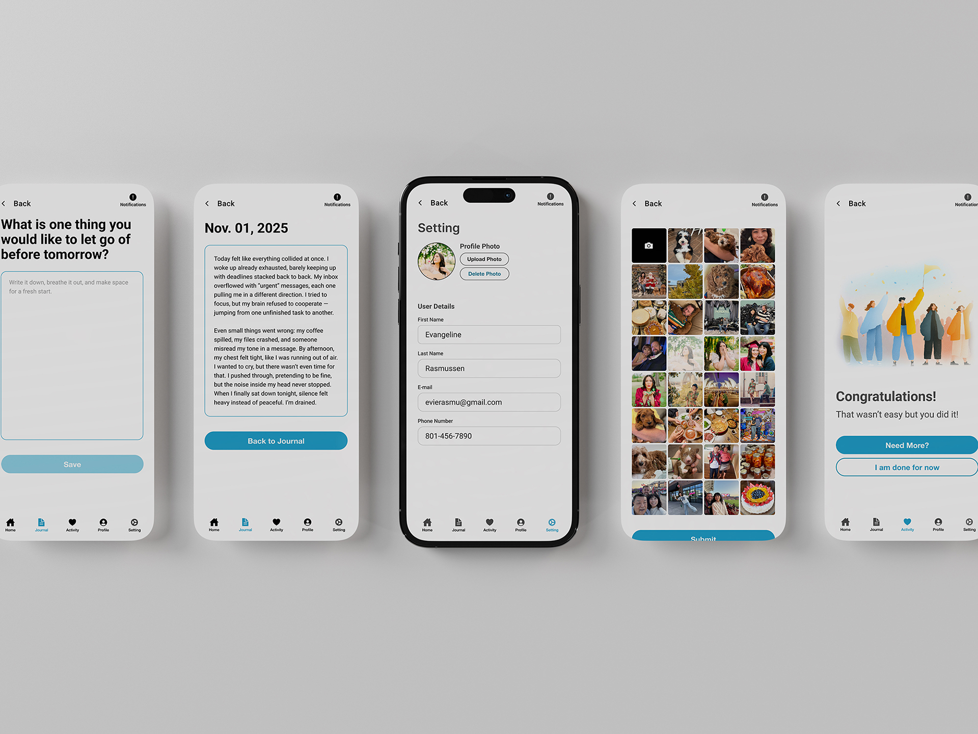
The app’s structure moves through onboarding, personality testing, results, personalized activities, journaling, and profile settings. Early wireframes focused on reducing cognitive load, while mid- and high-fidelity iterations refined clarity, flow, and ease of navigation.
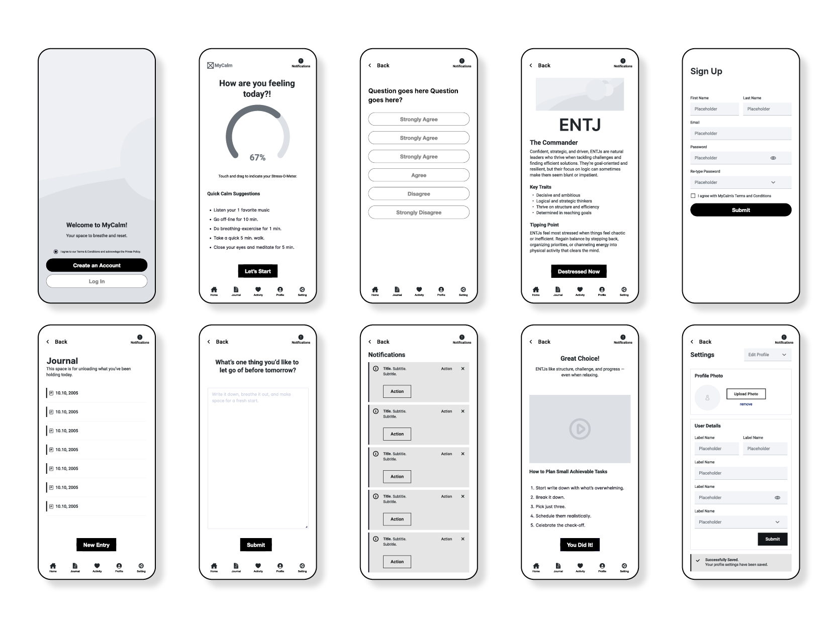
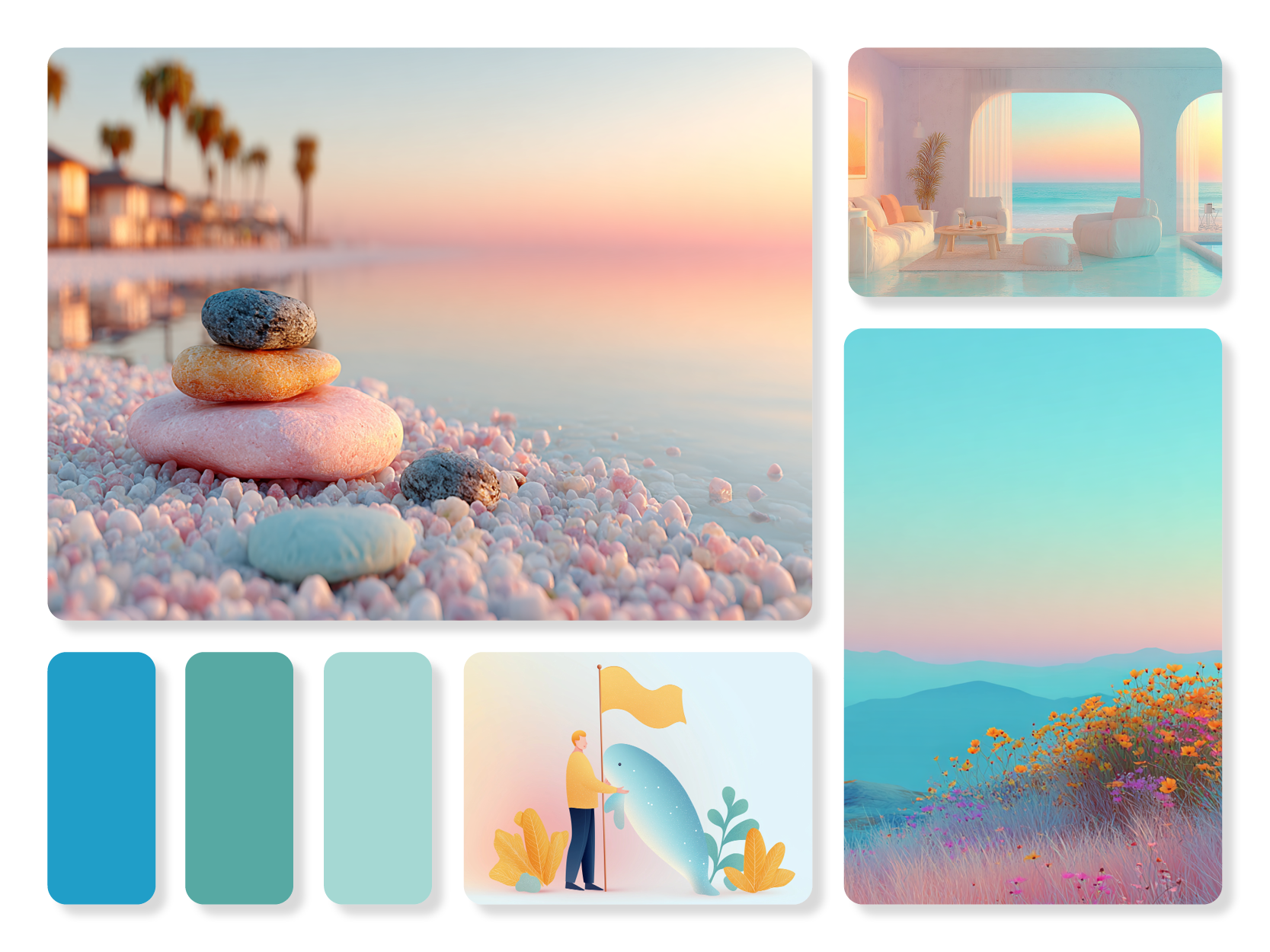
08. Visual System
Calmology’s visual system uses warm neutrals, soft greens, rounded typography, and minimal icons to create a calm, approachable atmosphere. The key screens—onboarding, personality test, results, activity recommendations, and journal—highlight the personal interactions that define the experience.
09. Usability Testing
I conducted usability testing with three participants to evaluate core tasks: adding a profile photo, completing a destress activity, and entering a journal entry. Overall, users completed the tasks successfully, but several friction points revealed opportunities to refine clarity, navigation, and
visual hierarchy.
visual hierarchy.
Task 1: Add a Profile Photo
Users expected the upload option to be located in the Profile section. When they found it under Settings, it caused hesitation and extra searching. This showed a mismatch between user expectations and information architecture.
Insight:
Users associate photo upload with identity, not system controls. Relocating this feature to Profile or adding an in-context shortcut would reduce confusion.
Users associate photo upload with identity, not system controls. Relocating this feature to Profile or adding an in-context shortcut would reduce confusion.
Task 2: Complete a Destress Activity
Most users found the flow smooth, but some expected a personality test or setup sequence beforehand. Others were unsure whether they needed to continue through multiple activities or if they could exit with confidence.
Insight:
A brief onboarding tooltip such as “Try one activity — you can stop anytime” would clarify expectations and reduce uncertainty.
A brief onboarding tooltip such as “Try one activity — you can stop anytime” would clarify expectations and reduce uncertainty.
Task 3: Enter a Journal Entry
Users could create entries easily, but the Submit button’s low contrast made it feel inactive or untappable. One user also experienced disorienting back-navigation, returning to an unrelated screen instead of the Journal home. Another wanted a way to edit entries after submitting.
Insight:
Visual hierarchy and navigation need reinforcement. Stronger button contrast, consistent back-navigation, and an “Edit Entry” pathway would improve trust and usability.
Visual hierarchy and navigation need reinforcement. Stronger button contrast, consistent back-navigation, and an “Edit Entry” pathway would improve trust and usability.
Overall Patterns
Across all tests, three themes appeared
Visual clarity issues: Buttons felt too faint to press, reducing confidence.
Navigation uncertainty: Users weren’t always taken where they expected.
Expectation mismatches: Features appeared in locations different from where users naturally looked.
Navigation uncertainty: Users weren’t always taken where they expected.
Expectation mismatches: Features appeared in locations different from where users naturally looked.
Outcome
These insights guided updates to the interface: moving the photo upload to Profile, increasing button contrast, clarifying activity expectations, fixing back-navigation, and adding an entry editing option. The changes support a calmer, more intuitive flow that aligns better with user expectations.
10. What I learned
This project taught me how to design a full UX flow that responds to the user's emotional needs and empathy. I learned how research shapes design decisions and how small interactions can create a sense of support and calm.