A 90-Minute UX Sprint — Utah Tech Week 2026
Overview
At Vibe-a-Thon during Utah Tech Week 2026, each team received three random prompts and had 90 minutes to design and pitch a solution using only one AI design tool.
Prompts
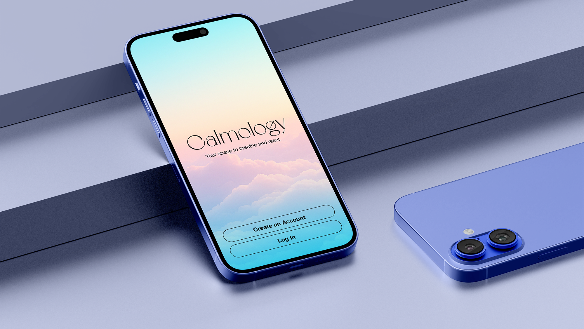
Harry Potter / Alaskan Wilderness / “I can’t organize the food storage.”
I reframed the constraint into a real product problem.
How do you manage food inventory in a remote cabin where resupply is limited and mistakes are costly?
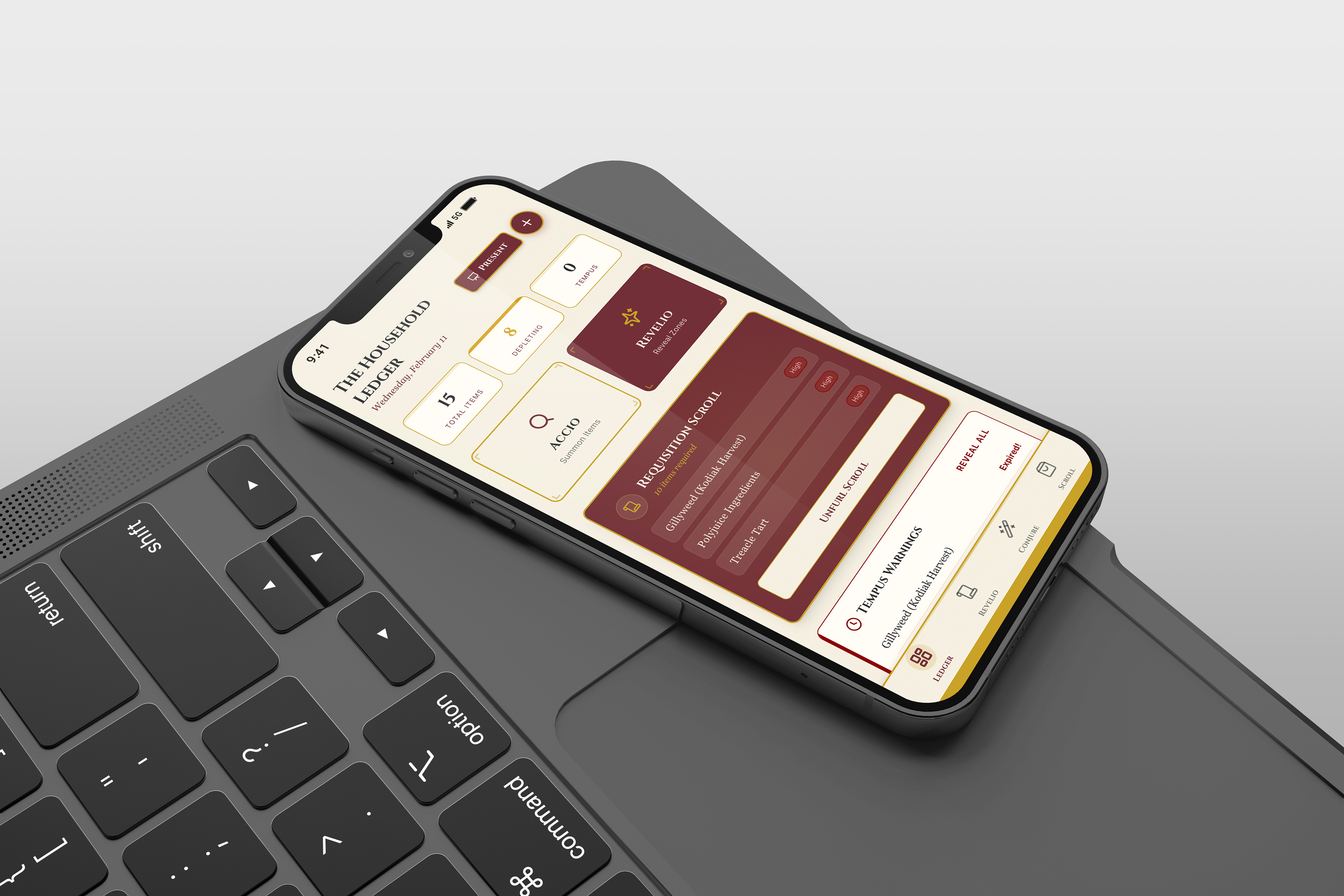
I designed a mobile-first pantry management app themed as a spell book, grounded in real inventory logic.
My Role
• Product concept
• Information architecture
• Core user flows
• Interaction logic
• Visual direction
• AI-assisted prototyping (Magic Pattern)
• Information architecture
• Core user flows
• Interaction logic
• Visual direction
• AI-assisted prototyping (Magic Pattern)
AI accelerated layout generation. System thinking and product decisions stayed with me.
Live prototype:
https://project-harrypotterpantry.magicpatterns.app/
https://project-harrypotterpantry.magicpatterns.app/
Problem Framing
In a remote cabin environment:
• Resupply is infrequent and expensive
• Food waste is costly
• Disorganization creates risk
• Users need fast logging under real conditions
• Food waste is costly
• Disorganization creates risk
• Users need fast logging under real conditions
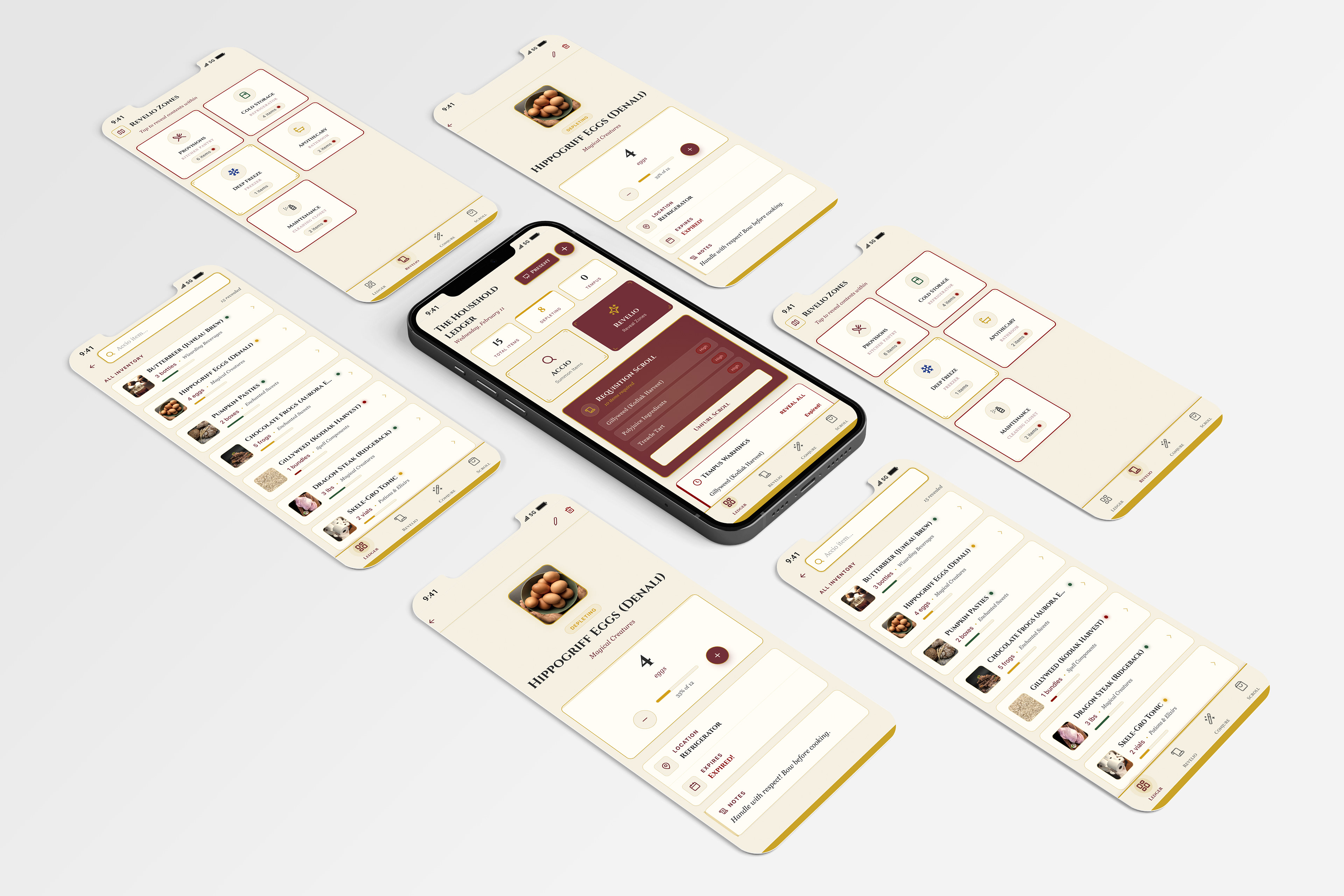
The core need was visibility of quantity, expiration and physical location.
Scenario Journey
• Arrive and unload supplies
• Log items quickly (scan or manual entry)
• Assign items to storage zones
• Monitor low stock and expiring items
• Plan meals based on urgency
• Generate a categorized requisition list before next supply run
• Log items quickly (scan or manual entry)
• Assign items to storage zones
• Monitor low stock and expiring items
• Plan meals based on urgency
• Generate a categorized requisition list before next supply run
This flow defined the product structure before any UI decisions were made.
Core User Flow
Start → Inventory Hub
Add + Organize
Inventory → Add Item → Scan or Manual → Select Zone → Set Quantity + Unit → Set Expiration → Save
Inventory → Add Item → Scan or Manual → Select Zone → Set Quantity + Unit → Set Expiration → Save
Track + Update
Inventory → Item Detail → Adjust Quantity / Change Zone / Edit Expiration → Save
Inventory → Item Detail → Adjust Quantity / Change Zone / Edit Expiration → Save
Plan Resupply
Inventory → Low Stock + Expiring Signals → Requisition List → Group by Category + Urgency
Inventory → Low Stock + Expiring Signals → Requisition List → Group by Category + Urgency
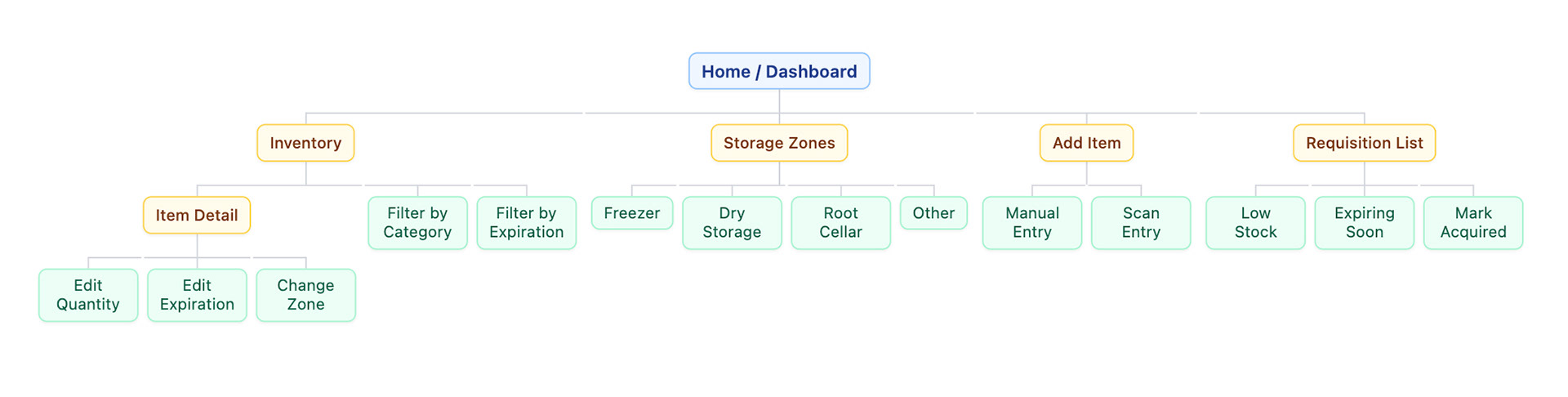
Information Architecture
Home/Inventory Hub
• Inventory list (filters:zone, category, expiration)
• Item detail (quantity, expiration, location)
• storage zones
• Add item (manual / scan)
• Requisition list (grouped by urgency)
• Item detail (quantity, expiration, location)
• storage zones
• Add item (manual / scan)
• Requisition list (grouped by urgency)
Organization mirrors physical space. That alignment reduces cognitive load.
Home / Overview
• Inventory list (filters: zone, category, expiration)
• Item detail (quantity, expiration, location)
• Storage zones (browse by physical location)
• Add item (manual / scan)
• Requisition list (shopping list by urgency)
• Inventory list (filters: zone, category, expiration)
• Item detail (quantity, expiration, location)
• Storage zones (browse by physical location)
• Add item (manual / scan)
• Requisition list (shopping list by urgency)
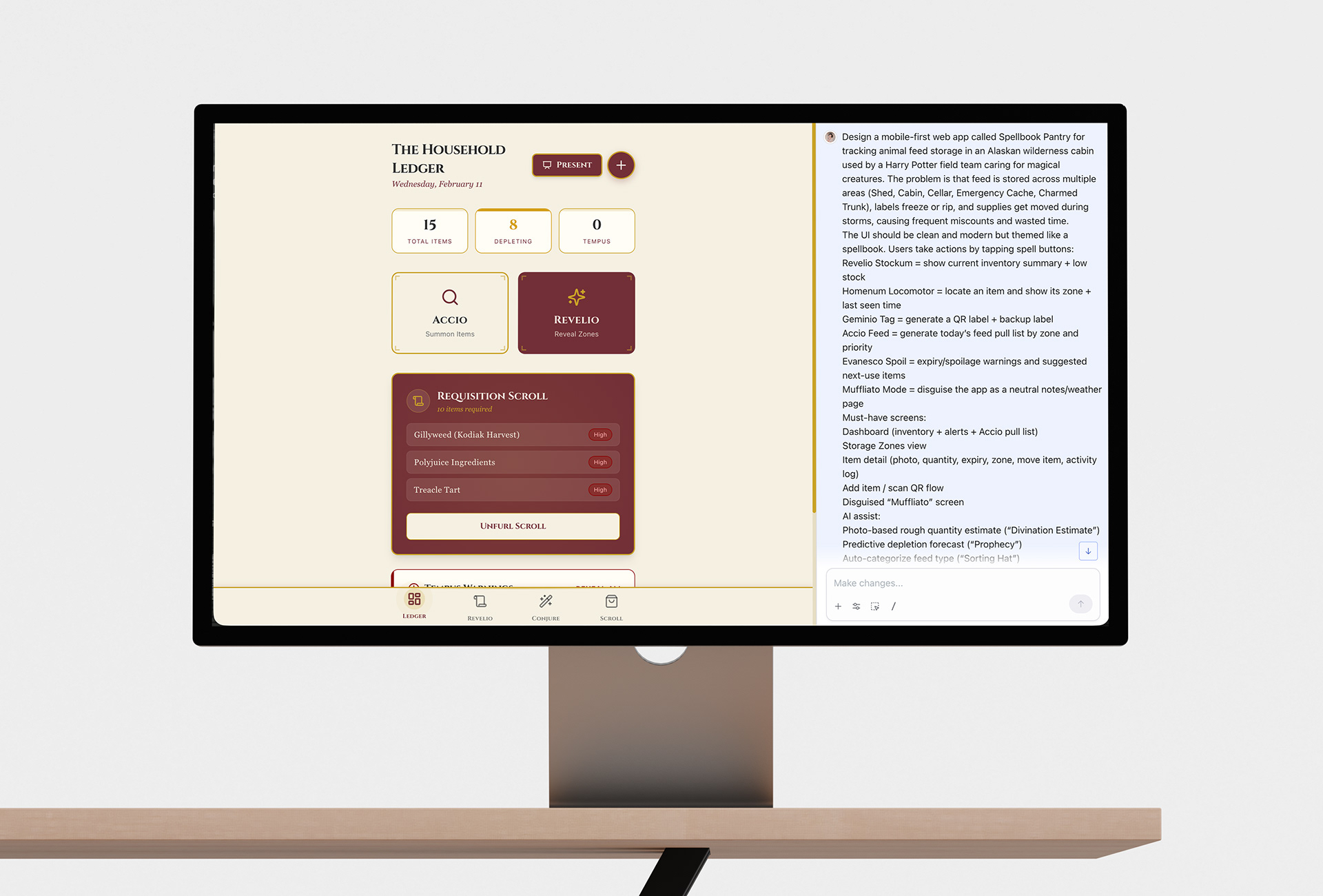
AI Workflow
I used Magic Patterns intentionally:
• Prompted by component, not full page
• Defined core tasks before generating UI
• Locked hierarchy early
• Kept expiration and location visually dominant
• Translated theme into functional labels without sacrificing clarity
• Prompted by component, not full page
• Defined core tasks before generating UI
• Locked hierarchy early
• Kept expiration and location visually dominant
• Translated theme into functional labels without sacrificing clarity
Key Design Decisions
• Quantity, expiration, and storage zone are always visible
• Low stock and expiration signals drive action
• Requisition list groups items by urgency
• Theme supports engagement but never competes with hierarchy
• Low stock and expiration signals drive action
• Requisition list groups items by urgency
• Theme supports engagement but never competes with hierarchy
The magical language and easily recognizable color scheme adds personality. The structure solves the problem.
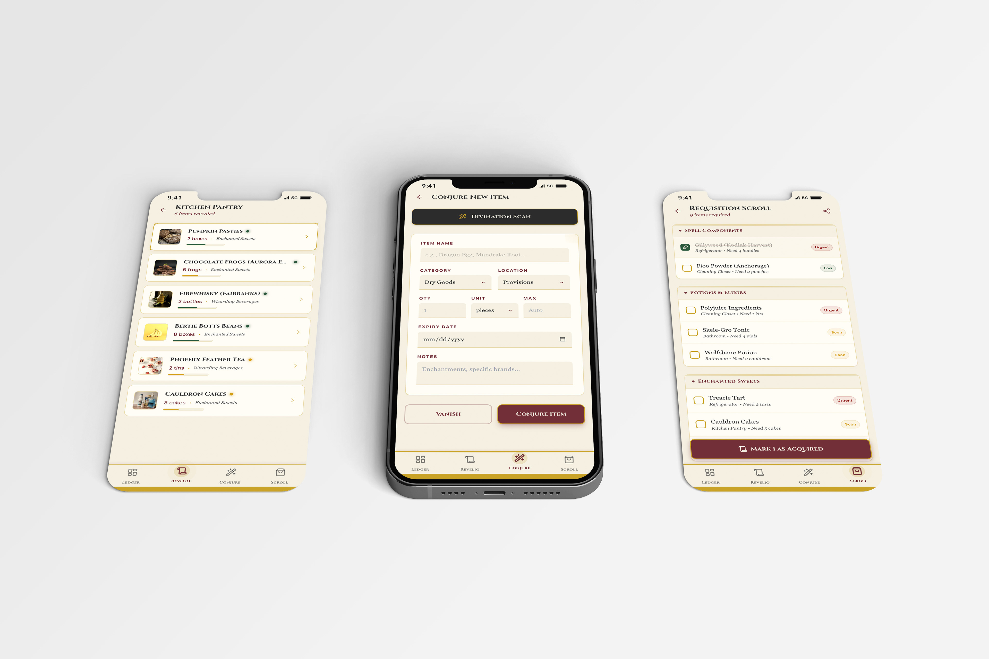
Key flow screens: pantry list with stock indicators, add-item form, and a requisition list grouped by category and urgency. I kept quantity, expiration, and location front and center to fix the real problem: disorganized, miscounted food storage in a harsh environment.
Reflection
Designing within 90 minutes using only AI required restraint.
I defined the system first:
• Core tasks
• Shared components
• Information hierarchy
• Shared components
• Information hierarchy
Once the logic was locked, the interface could move fast without drifting. This sprint reinforced how I use AI: As acceleration, not replacement.